The Art, Science and Business of Font

Graphic Design is the communication framework
through which messages about what the world is now —
and what we should aspire to — reach us.
— Rick Poynor, British writer on design and visual culture
I love fonts.
So I was delighted recently when Ogilvy New York created “TypeVoice,” a website that allows users to generate their own font with their own voice. The technology of TypeVoice records a user’s voice through a computer’s microphone and uses volume, pitch, and other audio parameters as variables and delivers to the user a customized font.
I share a deep interest in fonts, especially when I am typing or reading online content. The typeface and spacing between letters and lines can have subtle but decisive impact on my perception – almost as if good typography puts me in a good mood.
Font is something that is everywhere and at the heart of everything we do. But font is also something that we easily overlook. But font is also one realm in which a small change can shake your world.
I am intrigued by the aesthetics of typeface. But more intriguing is the science behind typography.
Now, follow me and let’s start the adventure!
The Aesthetic of Fonts
Before reading the book The Miracle of Font (フォントのふしぎ) by font designer Akira Kobayashi, I could hardly imagine that font designer was a job. I experienced fonts as pre-installed in computer systems. In his book, the font designer, who studied and worked in Japan, Germany and the U.K., shows photos of fonts and insights on how fonts communicate around the world.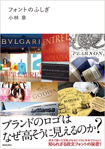
For example, when we see the logo of Louis Vuitton, we immediately associate it with luxury bags and fancy fashion shows.
But in Kobayashi’s eyes, the design of the logo helps the brand to build the high-end image with its kerning – a typography term for the space between each letter. See the comparison: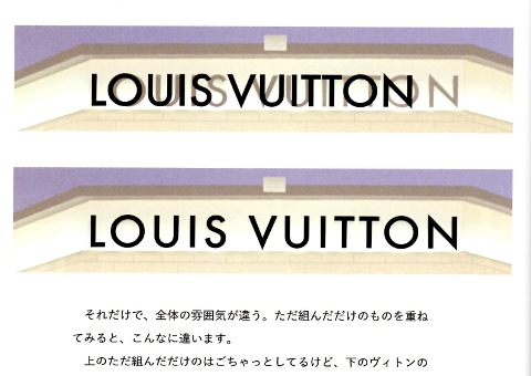
During my research on logotypes, I found a blog post that describes on how luxury brands design their logos with meticulous attention to font and kerning, and know that a small change in either can cause a significantly different perception of the brand.
Why does the space between letters matter?
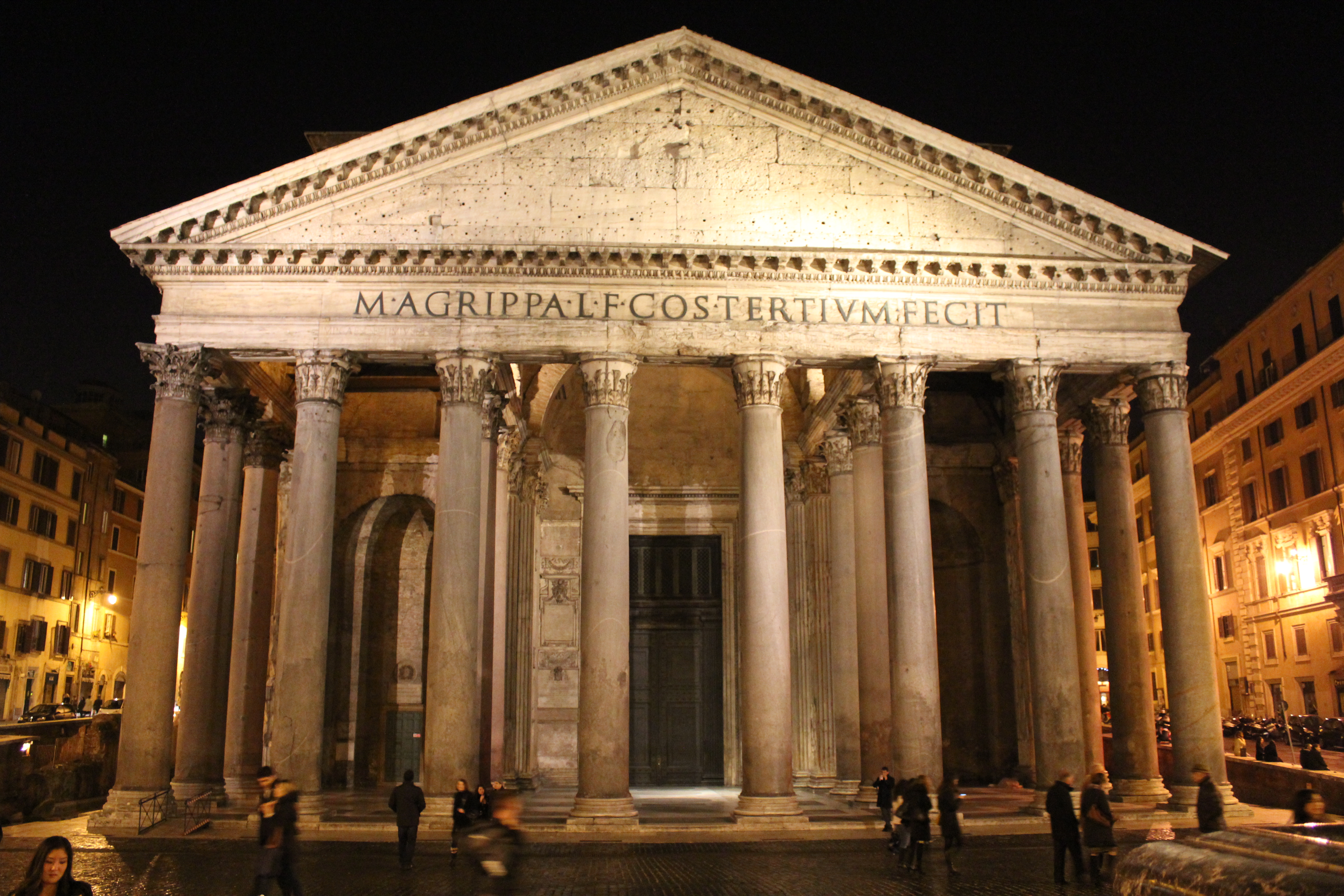
Kobayashi does not give us a final word, but he provides another example from ancient Rome. If you have visited the Pantheon or the Foro Romano (Roman Forum), you will be surprised that the ancient Romans did the same spacing between letters 2,000 years ago.
Kobyashi shows photos of the Roman inscriptions as follow:
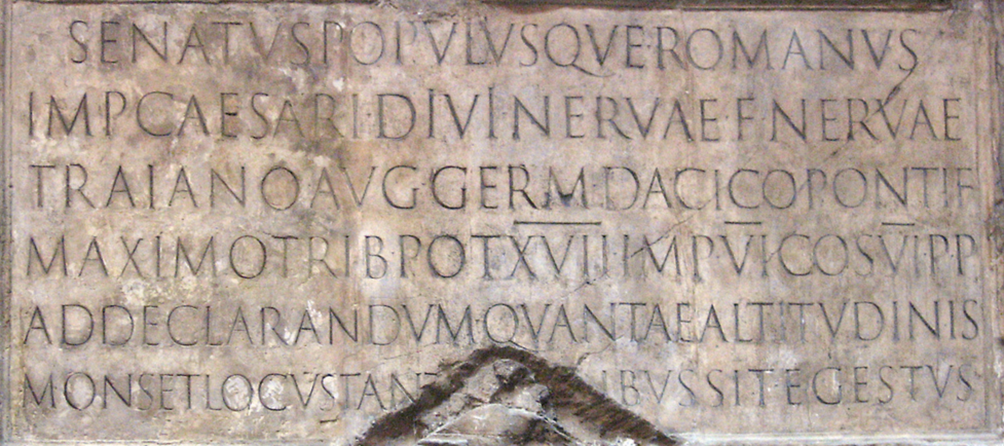
From a font designer’s view, Kobayashi explains that the ancient Romans intentionally spaced letters apart from each other, and made the words at the bottom smaller than those at the top. So, when people stand in front of the inscription, all the characters appear to be the same size because of the distortion of our view caused by the horizontal and vertical distance in between the letters.
According to The Study of Greek Inscriptions by A. G. Woodhead, the letters of Greek inscriptions are closely packed horizontally, whereas a certain space is left vertically between the lines. This is artistically effective, especially when the inscription calls for variety in size.
The Science Behind Fonts
In Space Between Words: The Origins of Silent Reading, Paul Saenger describes the neurophysiological effect kerning on the reading process in his book:
“Experiments demonstrate that the placing of symbols within the space between words, while preserving separation in a strictly grammatical sense, greatly reduces the neurophysiological advantages of word separation and produces ocular behavior resembling that associated with un-separated text.
From the reader’s vantage point, the salient quality of intra-textual space is not its relative width in comparison with a letter, but the rapidity with which the eye can distinguish it from the spaces otherwise contained within a text, that is, the space between letters and within letters.”

So, the space between letters and the space within letters need to be intentional. Neurophysiologically, the kerning helps us read more easily, whether ancient inscriptions or modern logotypes.
Kevin Larson of Microsoft Advanced Reading Technologies and Rosalind Picard of Massachusetts Institute of Technology argue that good typeface leads to better cognition.
They prepared the same content, an article from the New Yorker, using two different typefaces. They showed one half of a study group the text in good typography and the other half the identical copy in poor typography. Participants were asked to perform cognitive tasks after reading the texts.
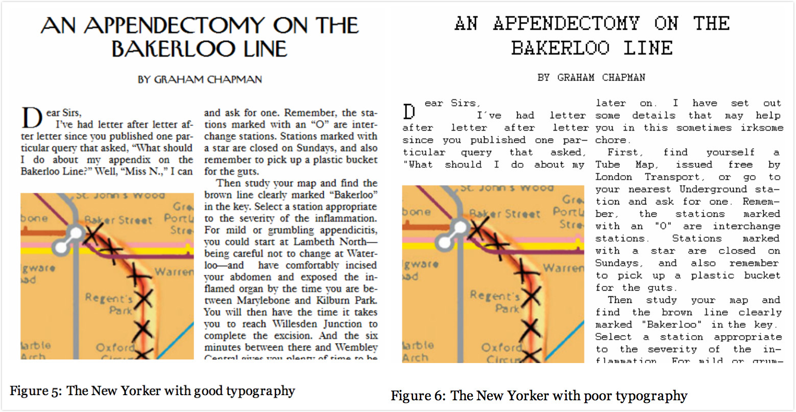
Those who read the good typography performed better than those who read the poor typography. In one task 4 out of 10 participants who read the good typography successfully solved the task, but 0 out of 9 participants who read the poor typography solved the task.
The Most Influential Font Around the World
The one font that influences the world the most is Helvetica.
Here is a brief list of the famous brands that apply Helvetica in their logo:
The word Helvetica itself comes from the Latin name for the pre-Roman tribes of what became Switzerland. But today it is really considered as a global font in modern font design. There is even a Helvetica documentary that explores how the typeface affects our lives.
As someone who cannot live without museums and exhibitions, I feel so regretful to miss the 50 Years of Helvetica exhibition at New York’s Museum of Modern Art. Helvetica is also the first typeface acquired for MoMA’s collection.
German typographer Erik Spiekermann jokes about how much the world loves to use this typeface: “Most people who use Helvetica, use it because it’s ubiquitous. It’s like going to McDonald’s instead of thinking about food. Because it’s there, it’s on every street corner.”
Helvetica has also been used globally in the transportation system. It is the official typeface of the New York City Subway (MTA).
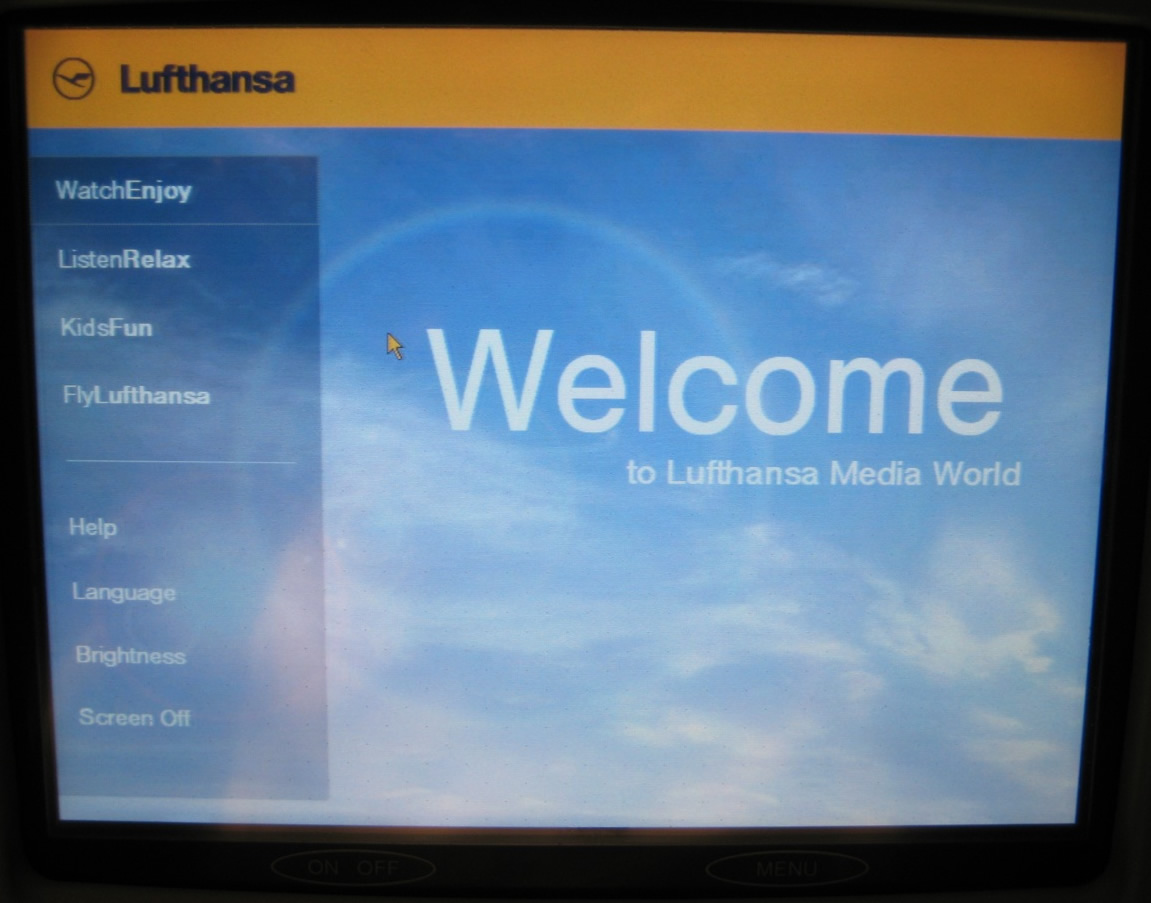
Helvetica has also been applied as the corporate type of Lufthansa to unify its corporate image. The German airline applies the typeface of its logo to all forms of writing, from the menu on flights, to postcards to all publications and screens in the cabin. Even “Welcome” in its brochure and screen is written in Helvetica. In this way the typeface consistently represents the corporate image of Lufthansa.
Why did Helvetica conquer the world? Here I have three answers.
- First, as the description in MoMA’s exhibition reads: “Helvetica communicates with simple, well-proportioned letterforms that convey an aesthetic clarity that is at once universal, neutral, and undeniably modern.”
- Second, when the designer of Helvetica died in 2014, the Guardian newspaper explained, “In 1960s America, the new discipline of corporate identity consultancy used Helvetica like a high-pressure hose, blasting away the preceding decades of cursive scripts, pictorial logos, excitable exclamation marks and general typographical chaos, and leaving in its place a world of cool, factual understatement.”
- My own answer is much simpler: Helvetica was designed in the time (1957) where the post-war world was craving a change. Its simplicity and clarity is just the opposite of those old decorative fonts. That is probably also the reason why there are so many anti-Helvetica voices today. This font leads the trend of clarity and simplicity in font design for 59 years. It might be time for another change.
How Fonts affect Business
Now we know the aesthetic and science behind fonts, and we know how much love companies can show towards one particular typeface. With the background knowledge, we can easily understand why the following backlash happen:
Half year ago, Google and Apple changed their fonts one after another.
Google applied a custom geometric sans serif Product Sans to remain its “simple, friendly and approachable” style by, “combining the mathematical purity of geometric forms with the childlike simplicity of schoolbook letter printing.”
At the same time, Apple’s new system iOS 9 came equipped with the new font San Francisco – the same font used on the Apple Watch.
If you check the online comments of these two font changes, you will find predominantly negative feedback. (Since most of them contain words that are too unpleasant to share, I would suggest you read Why You Hate Google’s New Logo by The New Yorker and Why Apple Abandoned The World’s Most Beloved Typeface by Wired.) (pictures of both changes)
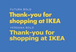
In 2009, IKEA changed the font of its logo from Futura to Verdana. The intention, according to Ikea’s spokesperson Monika Gocic, was that, “it’s more efficient and cost-effective.” We don’t know how much IKEA saved, but we do know that the change caused public disapproval and protests demanding the furniture retailer change back to the original logo.
In 2010, Gap Inc. also changed the font of its classic logo from Spire to Helvetica, which also evoked huge backlash. One angry designer described the new logo as “a grilled chicken without salt and pepper” because the typeface was not aligned with the brand image. Within one week, Gap Inc. gave up the new alteration and have been using the original logo ever since. (pictures of both changes)
![]()
It is no surprise that such arbitrary changes caused a public backlash. As we have learned from previous scientific theories, a good typography can induce good mood and a bad typography can induce bad mood.
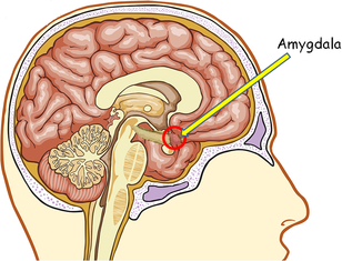
In the context of changing brand logotype, consumers are angry not because of how the new font looks, but because the old one, with which they have a strong emotional connection, is gone without reasonable explanation or timely heads-up. So, don’t blame consumers, it’s not their fault, it’s the amygdala that controls their reaction.

Leave a Reply
Want to join the discussion?Feel free to contribute!